
Multi-Brand, Dark Mode, and Profiles
Five independent dimensions
// Visual axes never carry authorization or data-contract meaning.type ColorMode = "light" | "dark" | "system";type BrandTheme = | "enterprise-neutral" | "legal-navy" | "legal-amber" | "legal-burgundy" | "legal-jade" | "legal-orange";type Density = "dense" | "compact" | "comfortable" | "spacious";type ShellPreset = "side" | "top"; // frozen implementation: minimal/responsive exist only on paper// The product profile, not an individual page, selects workspace behavior.type WorkspaceMode = "single-route" | "managed-tabs";| Axis | May change | Must not change |
|---|---|---|
| Mode | Surfaces, text, borders, shadows, ramp mapping | Brand, permission, structure |
| Brand | Brand ramp, controlled accent, navigation temperature | Status semantics, workflow, menu capability |
| Density | Control height, table height, field gaps | Reference spacing, font family, page content |
| Shell | Global regions and navigation direction | Theme, SDK, permission |
| Workspace | Open, switch, close, and restore behavior | URL identity and backend authorization |
Brand provides Reference aliases. Mode maps them to System roles. CSS declaration order must not decide Brand and Dark combinations.
The first three dimensions are the orthogonal visual axes defined by ADR 0801. The last two are Experience Patterns. A Profile composes defaults for a product context; it is not a sixth visual axis and carries no permission or business meaning.
Default profiles
| Startup input | Shell | Workspace | Density |
|---|---|---|---|
| Defaults (no env vars) | Side | Managed Tabs | dense |
VITE_SHELL_PRESET=top | Top | Single Route | user/tenant choice |
| Login template routes | fixed | Single Route | set by the template |
The Legal desktop default brand is legal-navy, and the workbench default density is dense; Compact and looser tiers are explicit user choices, never implied by identity.
Identity never displays the business sidebar or Workspace Tabs. One product area does not mix Side and Top page by page.
Dense is the desktop high-density level for large tables, complex filters, and bulk actions. Public Identity and touch contexts remain Comfortable.
Selection and persistence
Resolve configuration in this order:
Product allow-list -> explicit tenant Brand and Profile -> user Mode and Density preference -> operating-system color preference -> enterprise-neutral fallback- Persist Mode, Density, sidebar collapse, and an allowed Theme preference.
- Resolve tenant themes from a server-provided allow-list; never accept arbitrary CSS.
- localStorage may hold presentation preferences, never TenantId, UserId, Role, Permission, or refresh tokens.
- Resolve Mode, Brand, Density, and the system color scheme before React mounts.
AppearanceProviderowns the three appearance axes at runtime;AccessibilityProviderowns the accessibility axes.
Accessibility overrides
Beyond the three appearance axes (Brand/ColorMode/Density) the system defines seven accessibility override axes. AccessibilityProvider writes them as data-* attributes driving CSS cascading, each persisted independently under bitz.accessibility.*:
| Axis | data attribute | Values | Effect |
|---|---|---|---|
| Font scale | data-font-scale | 100 / 115 / 130 / 150 | Scales --sys-type-* and control typography; 150% targets low vision |
| Contrast | data-contrast | high | Text, borders, focus rings, and state colors switch to extreme mappings |
| Color vision | data-color-vision | protanopia / deuteranopia / tritanopia | State colors (danger/success/warning/info) become color-vision friendly |
| Reduce motion | data-reduce-motion | auto / on / off | Structural motion becomes instant; state changes remain but do not move |
| Cursor assist | data-cursor-assist | standard / large / highlight | Larger cursor or highlight follower for pointer visibility |
| Screen reader | data-screen-reader | auto / optimized | Hides decorative motion and redundant announcements for screen readers |
| Page outline | data-page-outline | auto / left / right / off | Header appears on scroll or a ghost side ruler marks the current zone |
Accessibility axes do not affect brand identity, page structure, or permissions. High contrast and color-vision overrides remap System roles from the Reference layer without introducing raw colors. Font scale and reduce motion respect prefers-reduced-motion and system accessibility settings, but users can override explicitly in preferences.
Current runtime facts
The management application currently accepts six Brands, Light/Dark/System, four Density IDs, and Side/Top. The first-paint script restores only allow-listed local cache values; the typed Menu preference is the authenticated cross-device source of truth. Identity uses Minimal Shell and a fixed density suitable for anonymous forms, which product pages cannot override.
Current management routes use Single Route. Stable URLs, dirty-state confirmation, cross-login restoration, and invalid-resource handling for Managed Tabs remain conformance work. Local page tabs, separate browser tabs, and pinned views are not substitutes for that implementation.
Dark-mode discipline
- Dark is not a simple inversion of Light.
- Neutral surfaces, text, borders, and shadows have explicit Dark mappings.
- Status colors have explicit Dark foreground, background, and border values.
- Brand actions usually map from 700 in Light to 300 in Dark;
legal-orangeis the registered exception (500 in both Light and Dark). Contrast is verified per theme. - Dark mode does not change table density, shell regions, or field count.
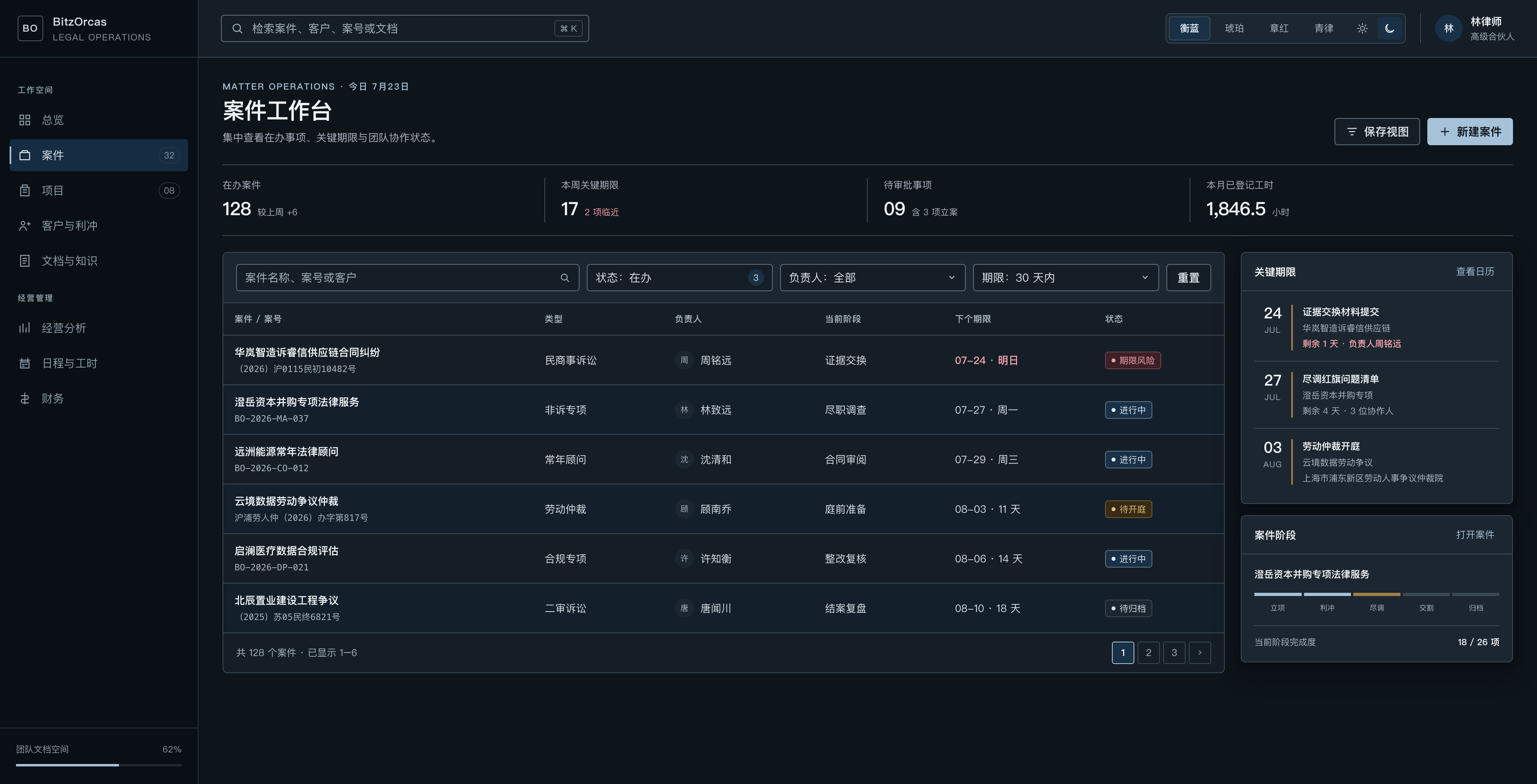
The contract is frozen. The complete Dark regression matrix across six brand themes is an implementation gate; screenshot alignment with product code follows the Design Guardian conclusion.