
Color and Legal Themes
Neutral surfaces and text
| System Token | Light | Dark | Use |
|---|---|---|---|
--sys-color-canvas | #F5F7F9 | #0D141A | Application background |
--sys-color-surface | #FFFFFF | #151E26 | Default work surface |
--sys-color-surface-raised | #FFFFFF | #1B2630 | Popover, dialog, sheet |
--sys-color-surface-subtle | #EEF2F5 | #1B2630 | Query and quiet regions |
--sys-color-surface-hover | #F6F8FA | #202C36 | Neutral hover |
--sys-color-text-strong | #17212B | #F2F5F7 | Headings and key data |
--sys-color-text-default | #2D3A47 | #DCE3E8 | Body text |
--sys-color-text-muted | #586777 | #AAB6C1 | Supporting text |
--sys-color-border-subtle | #D4DCE4 | #3A4855 | Separators |
--sys-color-border-control | #8795A5 | #5E6D7A | Required control boundaries |
Inputs cannot rely on border-subtle as their only boundary.
Status colors
Status colors do not change with Brand.
| Role | Light FG | Light BG | Light Border | Dark FG | Dark BG | Dark Border |
|---|---|---|---|---|---|---|
| Danger | #A92D38 | #FFF0F1 | #E2A2A8 | #F0A0A7 | #3B2026 | #74404A |
| Success | #246745 | #EDF8F2 | #9DCDB2 | #9DD4B4 | #173126 | #3E6952 |
| Warning | #704A00 | #FFF7E0 | #D8B25C | #E5C071 | #372B16 | #715A2A |
| Info | #205C7A | #ECF6FB | #9AC6D9 | #9CC9DC | #17303D | #3A667B |
Brand semantics
| Role | Light | Dark |
|---|---|---|
| Primary action | Brand 700 | Brand 300 |
| Primary hover | Brand 800 | Brand 200 |
| Primary active | Brand 900 | Brand 400 |
| Primary foreground | #FFFFFF | #0D141A |
| Link | Brand 700 | Brand 300 |
| Focus ring | Brand 500 | Brand 400 |
| Selection | Brand 100 / Brand 900 | Brand 900 / Brand 100 |
| Navigation background | Brand 500 | Brand 700 |
| Navigation active line | Brand 500 | Brand 500 |
Registered brandOverrides
The default brandMapping applies to all themes. Themes that need to deviate from the default mapping for contrast reasons register an override in the brandOverrides block of system.tokens.json:
| Theme | Mode | Deviation | Reason |
|---|---|---|---|
legal-amber | Light | focusRing=600, navigationFg uses dark text | Amber 500 as a focus ring lacks contrast; dark navigation foreground improves readability |
legal-orange | Light / Dark | actionPrimaryBg=500 (+hover 600 / active 700), white foreground | Orange 700 is too dark and loses vibrancy; 500 is used for the primary button with white text. This is the only registered exception for the primary action step |
Unregistered themes use the default brandMapping. New exceptions must be recorded here with WCAG contrast verification.
Slate
Framework and generic Platform use a separate low-chroma Slate fallback named enterprise-neutral.
It is not part of legalBrandThemeIds, but the current workspace picker exposes it as the Slate
option in the governed six-theme order.
Navy
Gold
Primary action colors for Light/Dark come from the role mapping in system.tokens.json: brand step 700 in Light and step 300 in Dark; the theme itself carries no action-color special case. legal-amber has exactly two brand overrides: focusRing raised to step 600 (the champagne-gold 500 lacks focus-ring contrast) and a darker navigation foreground in Dark. Exact values live in frontend/packages/materials/src/tokens/source/themes/legal-amber.tokens.json (currently 500=#C5AD78, 700=#6D522B); this page never hand-copies swatches.
Burgundy
Jade
Orange
Both Light and Dark primary actions use Brand 500 (#FA8919) with a white foreground. This is the only registered exception for the primary button step: other themes use 700 in Light and 300 in Dark, but orange 700 is too dark and loses the brand’s energy. Focus ring uses step 700 to maintain contrast on light surfaces.
Component consumption examples
Component implementations consume Component Tokens first, leaving Brand, Mode, and interaction-state resolution to generated output:
/* A button never reads a color ramp or branches on the active theme. */.primary-action {  color: var(--cmp-button-primary-fg);  background: var(--cmp-button-primary-bg-default);}
.primary-action:hover {  background: var(--cmp-button-primary-bg-hover);}
When a custom pattern has no Component Token, it may consume a System semantic role. Status UI must not borrow red, green, or orange from the active Brand:
/* Danger remains the same semantic role when Brand or Mode changes. */.delivery-failure { color: var(--sys-color-status-danger-fg); background: var(--sys-color-status-danger-bg); border: 1px solid var(--sys-color-status-danger-border);}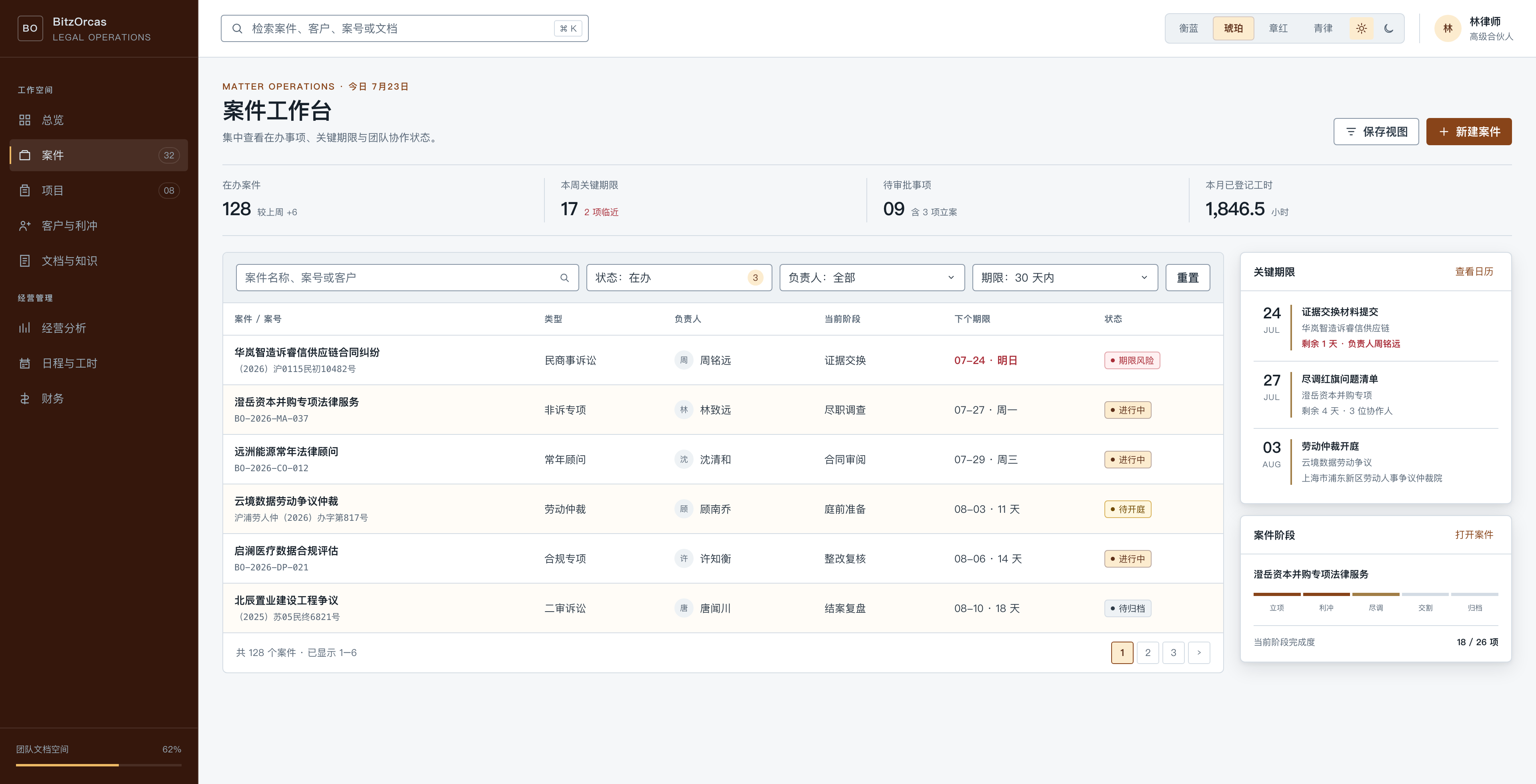
The specimen freezes direction, not product-code conformance.