
Application Shell and Workspace
Shell and Workspace are patterns, not themes. A theme changes brand expression without changing navigation. A product area does not choose a different shell for each page.
Stable regions
Global Brand / ProductGlobal NavigationGlobal Search / CommandWorkspace SwitcherPage ContextUser / Notification / HelpContent ViewportOptional Contextual UtilityGlobal capabilities belong in the Shell. Page actions belong in the Page Header or a local toolbar. Do not repeat the same primary action in the top bar, sidebar, and page header.
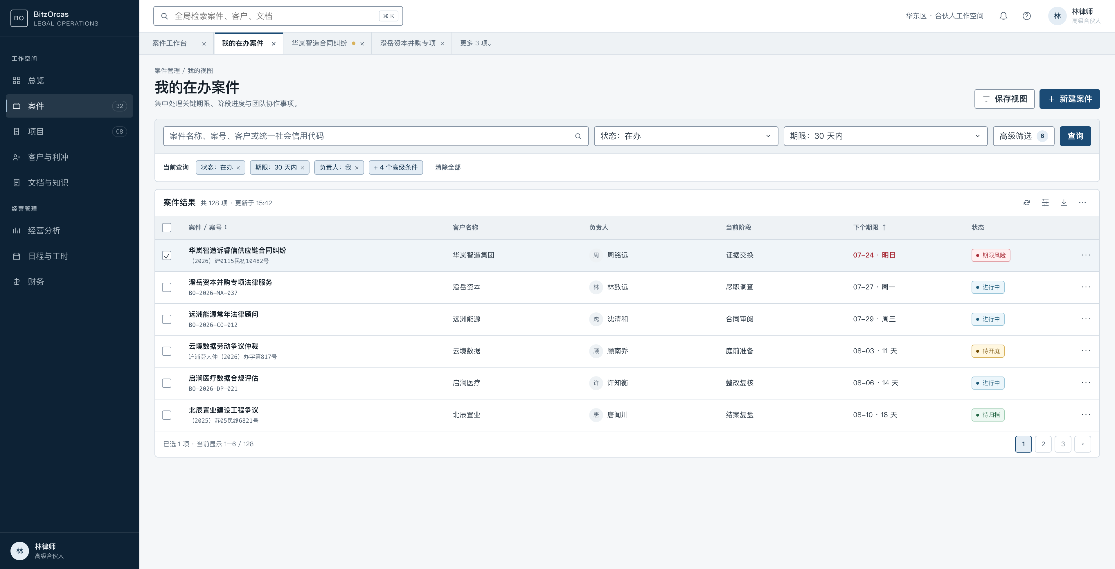
Side Shell
Use Side Shell for a deep legal workspace with many modules and long task sessions.
| Property | Compact | Comfortable |
|---|---|---|
| Expanded width | 240px | 256px |
| Collapsed width | 64px | 68px |
| Global bar | 56px | 64px |
| Workspace tabs | 36px | 40px |
| Minimum primary item target | 40px | 44px |
- It starts expanded; collapse is a user preference.
- Keep at most two persistent menu levels.
- Express active state with surface, weight, and a 2px indicator, not color alone.
- Do not add a second persistent 240px navigation tree.
The governed two-stage Side Shell divides the same surface into a 64px module rail and a current-module panel: expanded width drags between 120–320px with a 176px default (64+176=240 matches the header’s magnetic grid). Results persist through a 120ms-debounced local preference synced by WorkspacePreferencesProvider — URLs, permissions, and menu ownership are untouched. Keyboard stepping and double-click reset are not implemented yet.
Top Shell
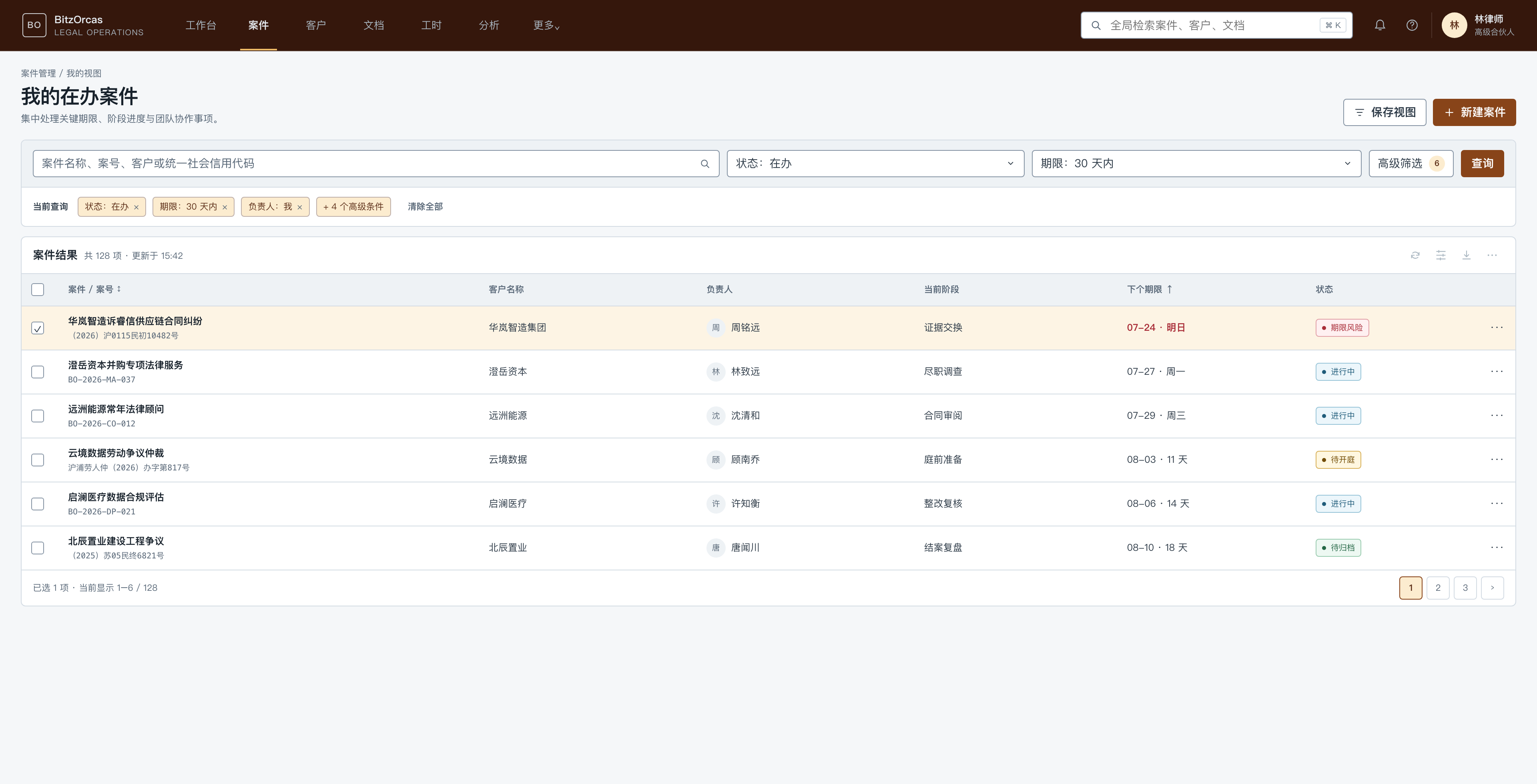
Use Top Shell for a smaller portal, frequent cross-module switching, or a search-centered product.
- The primary bar is 56px in Compact and 64px in Comfortable.
- The current-module secondary bar is 40px in Compact and 44px in Comfortable.
- Keep at most six first-level destinations and move the rest into More.
- Secondary Navigation, Workspace Tabs, and local page tabs are separate layers.
- Do not force brand, search, every module, and every utility into one crowded row.
- At constrained widths, replace direct destinations with a complete module menu rather than clipping authorized links.
Navigation ownership and sticky Local Tabs
| Type | Owner | Side Shell | Top Shell | Scroll behavior |
|---|---|---|---|---|
| Primary module navigation | Shell | Module rail | Primary bar | Fixed |
| Current-module navigation | Shell | Context panel | Secondary bar | Fixed |
| Workspace Tabs | Workspace Manager | Separate Shell row | Separate Shell row | Managed Tabs only |
| Local Tabs | Page | After Page Header | After Page Header | Sticky at the content viewport top |
Identity’s Users, Organization, Access, Security, Applications, and Workspace Governance destinations are current-module navigation. The active Shell renders them once; the Page Header does not duplicate them.
Actual page sections use WorkspaceLocalTabs. As the page scrolls, they remain one line and stick below the fixed Shell rows. The compact title and key actions enter the existing Global bar while Local Tabs stay at the content boundary.
Do not stack two visually identical Local Tab rows. A selected tab uses weight, foreground or surface difference, and a 2px indicator. At constrained widths it scrolls on one line or uses governed overflow; it never wraps or creates a vertical scrollbar.
Global bar tools
The right-side order is Search / Command (when owned) → Notification → Help (when owned) → Account.
Notification is a real server inbox with unread count, loading, empty, error, mark-one-read, mark-all-read, and validated internal destinations. Account owns user, current workspace, account security, and logout context.
Search, Help, Theme, and Density controls appear only after their route, permissions, state, and preference owner are complete. Never add dead controls just to imitate another product.
Single Route
- One browser URL represents one primary work surface.
- Do not render an empty Workspace Tab row.
- Local tabs switch sections inside the current resource.
- Use it for portals, settings, Identity, and narrow screens.
Managed Tabs
Use Managed Tabs to compare several matters or clients. Every tab has a stable URL and resource key.
Implementation must handle duplicate opens, overflow, pinning, close behavior, dirty-state confirmation, controlled restoration, deleted or unauthorized resources, tenant changes, and browser Back/Forward.
Workspace Tabs do not replace local tabs and must not turn every navigation action into a permanent tab.
Profile selection
| Scenario | Profile |
|---|---|
| Main legal desktop workspace | platform-workbench |
| Portal and search center | platform-portal |
| Login, MFA, and recovery | identity-flow |
| Mobile and touch | touch-context |
The product selects a profile at startup. The current Web app accepts VITE_SHELL_PRESET=side|top and safely falls back to side. Pages inherit the result.
Current configuration and implementation boundary
These variables provide safe first-paint defaults only. After sign-in,
WorkspacePreferencesProvider reads the allowed workspace preferences from the typed Menu endpoint
and synchronizes them across devices. Product pages must not read the environment again.
# Use only stable IDs accepted by the generated contract; an invalid shell falls back to side.VITE_BRAND_THEME=legal-navyVITE_DENSITY=denseVITE_SHELL_PRESET=sideSide/Top switching, the contextual navigation panel, and Single Route are present in the current management application. Managed Tabs in the profile table remains a frozen Pattern contract. Its overflow, dirty-state confirmation, and restore matrix are not closed, so local page tabs and pinned views must not be reported as a delivered Managed Tabs implementation.